Off Grid Energy
Off-Grid Energy was a completely new business with only a name when the project began. They needed a brand that felt dependable, modern and easy to understand — something they could start showing to potential partners and stakeholders as they began shaping their offering.
Strategy
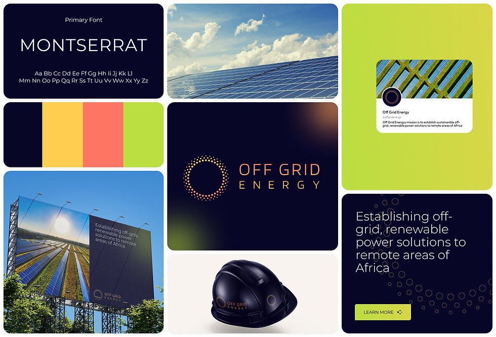
I created the brand from the ground up, developing the logo, colour palette, typography and overall visual direction. The work needed to come together quickly so the team could begin early conversations, pitch their vision and establish credibility from day one.

Strategy
The first step was to understand how similar companies presented themselves and where Off-Grid Energy could take a more user-friendly approach. Many competitors leaned into heavy engineering visuals, which created an opportunity for a calmer, more contemporary identity. The strategy focused on building a brand that communicated reliability and simplicity — something clear enough to support early stakeholder discussions without overwhelming people with technical detail.
Execution
I designed a modern, minimal logo inspired by the form and structure of a solar panel — a subtle reference to renewable energy without being overly literal. The colour palette and typography were chosen to feel fresh, warm and approachable, creating a visual identity that worked seamlessly across early pitch decks and stakeholder materials. Supporting elements such as spacing, icon style and simple graphic patterns helped the brand feel fully formed, even at this early stage.

Outcome
The brand came together quickly, giving Off-Grid Energy a cohesive identity they could use immediately for stakeholder presentations and early pitching. It provided clarity, credibility and a strong visual foundation that will continue to support the business as it grows and develops its offering.